Studio News
Pitch Decks for Dummies vol.1
Allie Veneruso ·
Studio News

You might have heard that the most important part of a pitch deck is the content, and that it could be delivered as a text-only PDF or a simple PowerPoint template and it wouldn’t matter, as long as the content is strong. Only the first part of that sentence is true. Yes, content is the most important aspect, but saying delivery makes no difference is absolutely untrue.
As humans, we’re inevitably susceptible to visual input. There’s a reason plating food is such a big thing in restaurants: even though it makes no difference to the taste, it’s considered fundamental. “You eat with your eyes first” doesn’t just apply to food. I remember in high school getting top marks on a biology research project (which I crammed at the last minute, to the shock of absolutely no one), simply because I used unique software that made the presentation interactive instead of a standard PowerPoint. The content wasn’t higher quality than my classmates’, but the delivery was, and that made a huge difference.
You might think that’s a small thing, but translated to my work today, that top mark in school would’ve meant being picked by a publisher over someone whose game idea was just as good. See where I’m going with this? Let me explain further.
I worked for two years at a company making branded game experiences, where we pitched to about ten clients per year (only counting the ones that went through after the partnerships team established contact). Us designers came up with the game idea, the producers built the schedule, marketing developed strategies, and then we dumped everything into a Canva deck. Every time, I’d look at it and feel unsure.
Then came the cavalry: the artists jumping in to “prettify” our presentation. It was like witnessing Dr. Frankenstein bringing to life the disassembled body parts we’d stitched together – except the result was far from a monster. On the rare occasions we had to present a deck without an artist’s touch, I could feel the difference. The client’s attention wasn’t as focused. You could see it on their faces: no matter how clearly we explained the design, visualizing it required extra effort that better graphics would’ve eliminated.
Can you guess which decks got picked? Yup.
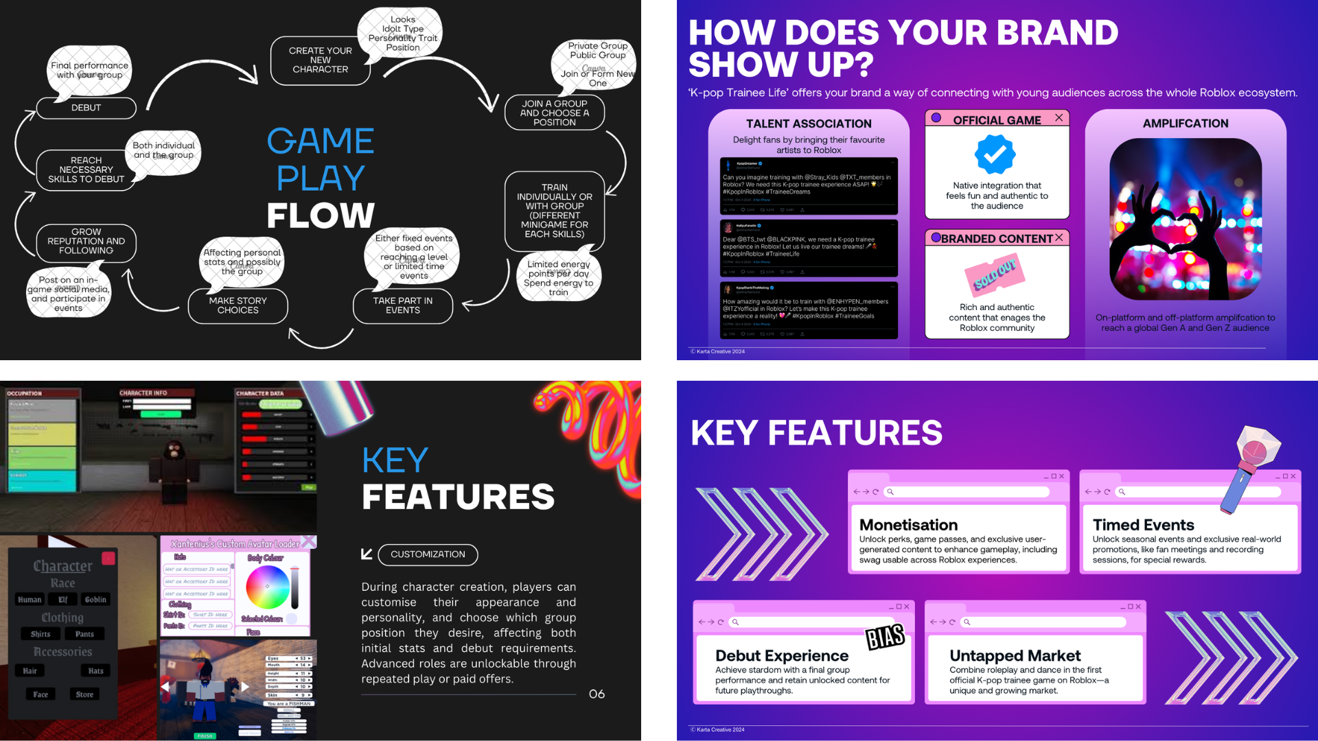
^ On the left is an example from my previous job, when I tried to make a deck for a personal idea. I had used a template already, yet look at the difference after our UI artist stepped in…
I know what you might say: ultimately, you should be able to wow someone regardless of tools and visuals. That’s why you’re told to always have your elevator pitch ready. If the core is rotten, it won’t matter how pretty the apple looks. I’m not arguing against that.
The original pitch for Race n’ Chase was essentially a barebones design document, and it eventually led to Grand Theft Auto becoming one of the most successful videogame franchises ever. Except that was 30 years ago, and even then, the publisher almost canned it! We’re now in an era of constant distractions and an oversaturated idea market. As harsh as it sounds, if you don’t instantly grab attention and help people visualize and remember your design, your chances of a follow-up are close to zero (realistically, zero).
Specifically when pitching for publishing deals, one of the most valuable lessons I learned through the accelerators MVGIE participated in is this: when you’re pitching at a publisher event, you’re not just pitching to the person in front of you. Your job is to pass on your passion and vision so clearly that they can later sit in front of a board and pitch your idea with the same clarity and enthusiasm. The way you deliver your pitch is not just about that moment, it’s about bringing your design to life in someone else’s mind.
I just spent about 600 words talking about visuals and delivery. If you’ve been following MVGIE, you might’ve spotted a contradiction. We don’t have an artist (yet). I just explained how important an artist is, yet we’ve not only survived pitching without polished visuals, we’ve even succeeded. So, am I lying? Am I secretly a talented illustrator? As stunning as my doodles are, I’m neither. And yes, I do believe our chances have occasionally suffered from not having a professional artistic eye.
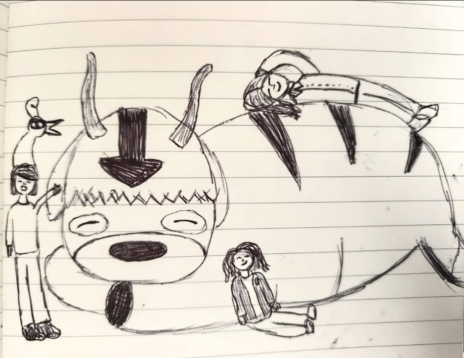
^ I know, I know. Hard to believe I’m not a professional artist.
However, as Phillip brilliantly explained in a past blog post, sometimes in an indie studio you have to wear hats you’re not comfortable wearing. Since Alex is spiritually 70 years old and Phillip prefers art where you can count the polygons, I decided to put to use the time I’d once spent testing fonts in PowerPoint instead of studying for school projects.
I quickly realized the learning curve was steeper than expected, and far less fun. Nonetheless, as with most things, practice makes better (because Hannah Montana taught me that nobody’s perfect), especially if you’re smart enough to work around your weaknesses.
Your best friend when it comes to decks is templates. There are thousands online. The first deck I made for MVGIE (for a previous game idea) used a free template from Slidesgo. It helped me define a colour palette, an art style, and layout guidelines (which I admittedly didn’t always follow). Even so, I had no real eye for what makes a slide visually engaging or easy to read, nor how to keep a style consistent when mixing free assets from different sources. It didn’t help that our game was difficult to explain and we didn’t even have a demo at the time.
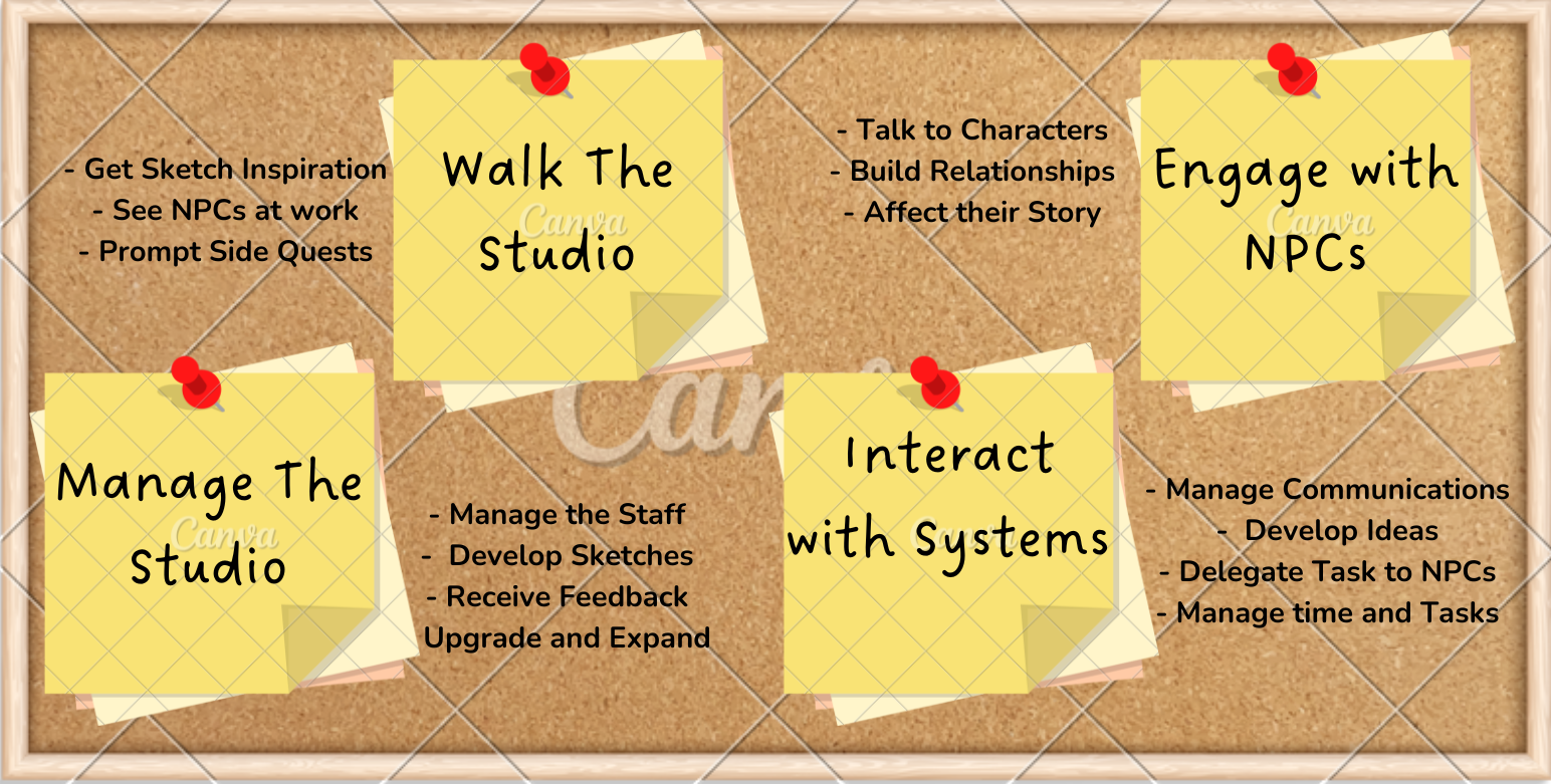
^ I tried many different options, but they all felt out of place and hard to read.
So I changed my approach.
Instead of starting with a template and modifying it, I used the template only to define the style and colour palette. Then I built my own mock-ups. That forced me to think about element positioning, how to guide attention toward the slide’s focus point (a big deal in art theory, even if I didn’t know what I was doing at the time), and how to use negative space effectively. I also leaned on visuals to compensate for the lack of gameplay footage, communicating aesthetic (N.B. in the game theory sense: the sensations a game evokes) and setting.
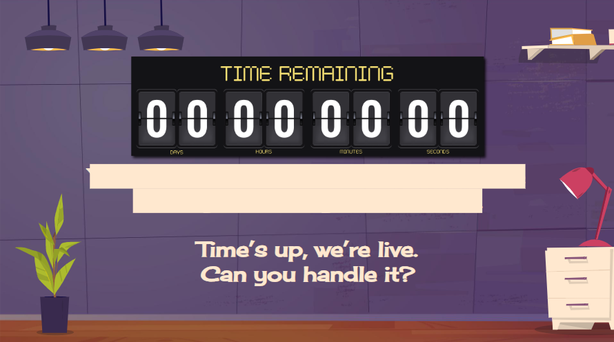
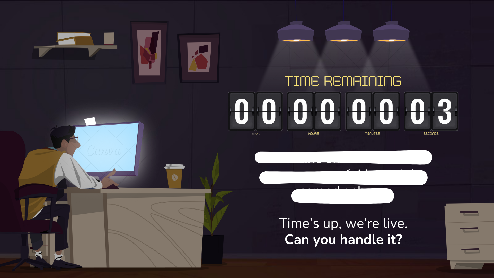
^ Two attempts from our first game idea (hence why the censorship), but with completely different vibes. The first attempt just presents information. The second communicates something about game feel even beyond the text.
The next problem: even if my vision improved, I still couldn’t illustrate it. I had ideas but no drawing skills. Watching former colleagues create magic in five minutes and comparing it to my five-hour struggle was… humbling, to put mildly. It became clear that learning to draw well enough wasn’t worth the time investment, thanks to a reasoning Phillip explained in his last blog post. By our second game idea, I had settled on a direction: since the game is fully diegetic (no overlay UI or menus), I wanted the deck to feel the same. I mocked up ways to integrate information diegetically, but finding ready-made assets that fit, and adapting them without spending endless hours in Photoshop, wasn’t realistic for my skill level.
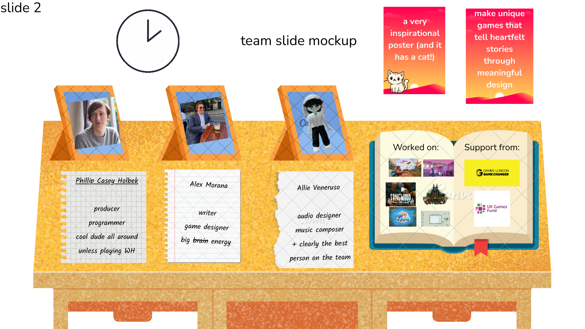
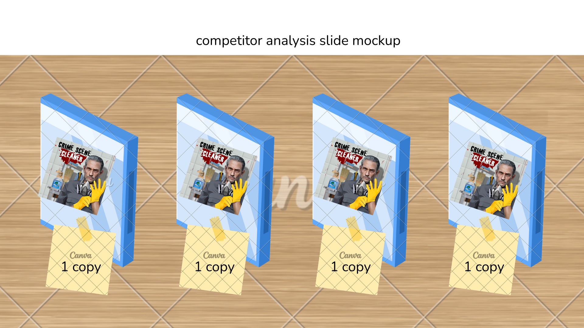
^ Mock-ups that required absurdly specific asset editing.
I experimented a lot. My most unhinged attempt? Using photography instead of graphics.
I stole alarm clocks and lamps from my parents and cigarettes from my brother to recreate our protagonist’s desk in real life. I tried to mimic our in-game lighting system by taking photos at different times of day across two days, all without photography experience or even a proper camera. Add poor exposure control, messy framing, and a three-day deadline for a funding opportunity (which we didn’t get), and yes, it was chaos.
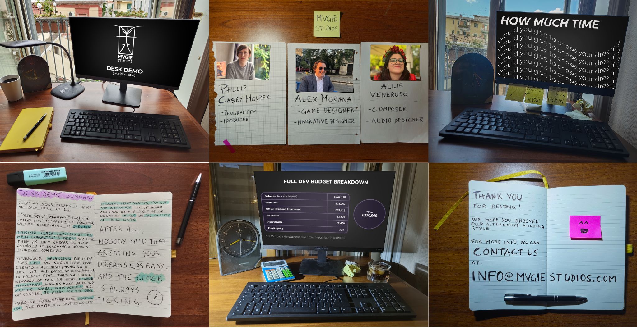
^ I still lacked “assets” even in real life, so I faked them in Photoshop. Some edits worked (like replacing printed photos from my childhood with our team’s faces). Others didn’t, like trying to redesign PS4 game covers as our competitors. That slide got scrapped so I don’t have it anymore, RIP.
That was a low point. But it helped shift my mindset.
While taking those photos, I noticed something: I was designing within constraints (sound familiar, game devs?). I only used objects available in my house. When I returned to Canva, I kept that approach. If I couldn’t find the right asset, I’d change the mock-up from the get-go. Unlike photography, I could adjust lighting and exact placement later. What I couldn’t do was create a correctly angled illustration in a consistent style. So I flipped the process: start with your own visual idea, yes, but search for assets right away, then adjust placement based on what’s available, add your content, and polish last.
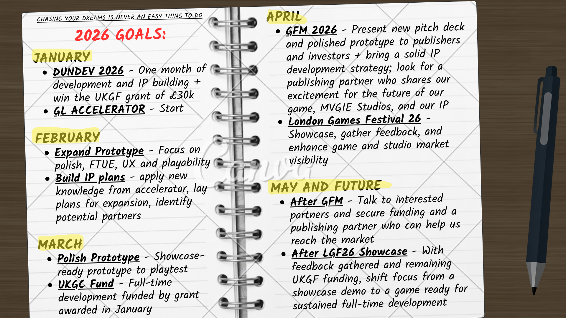
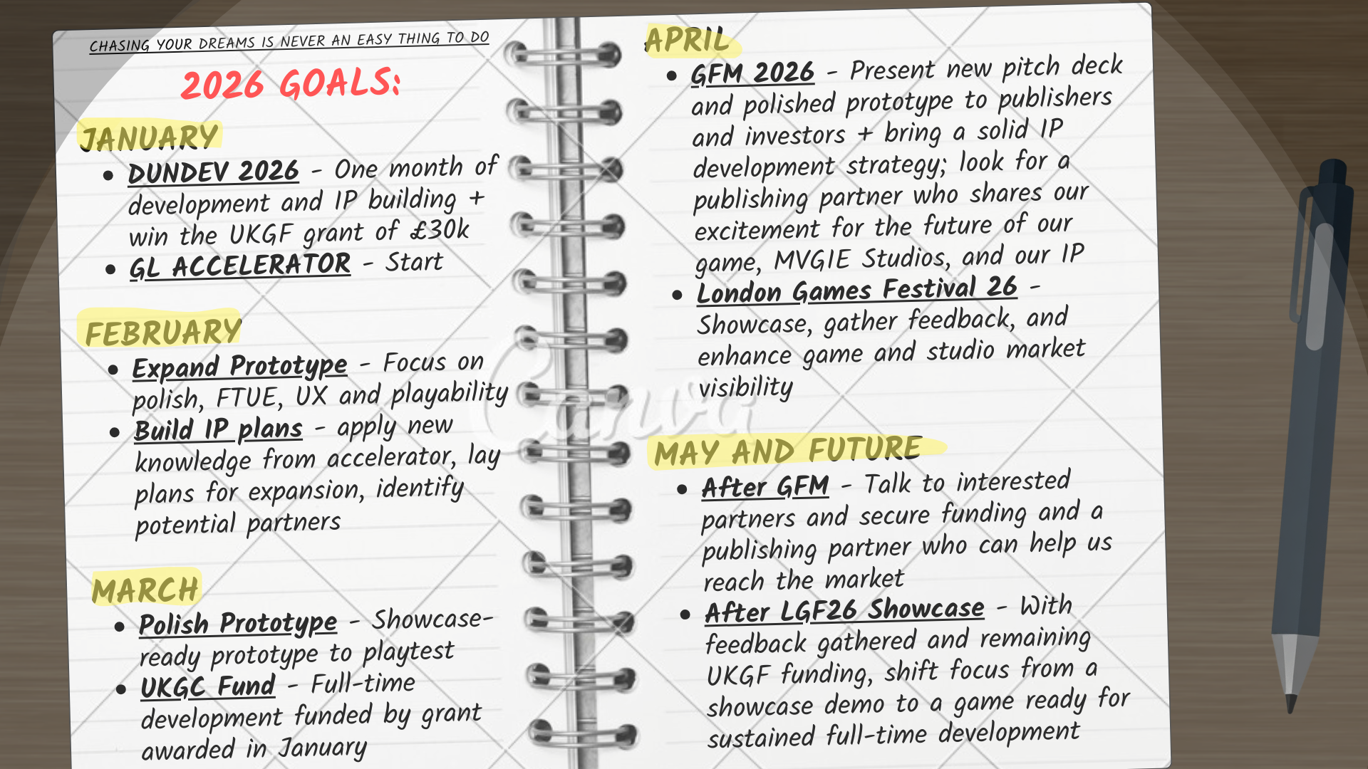
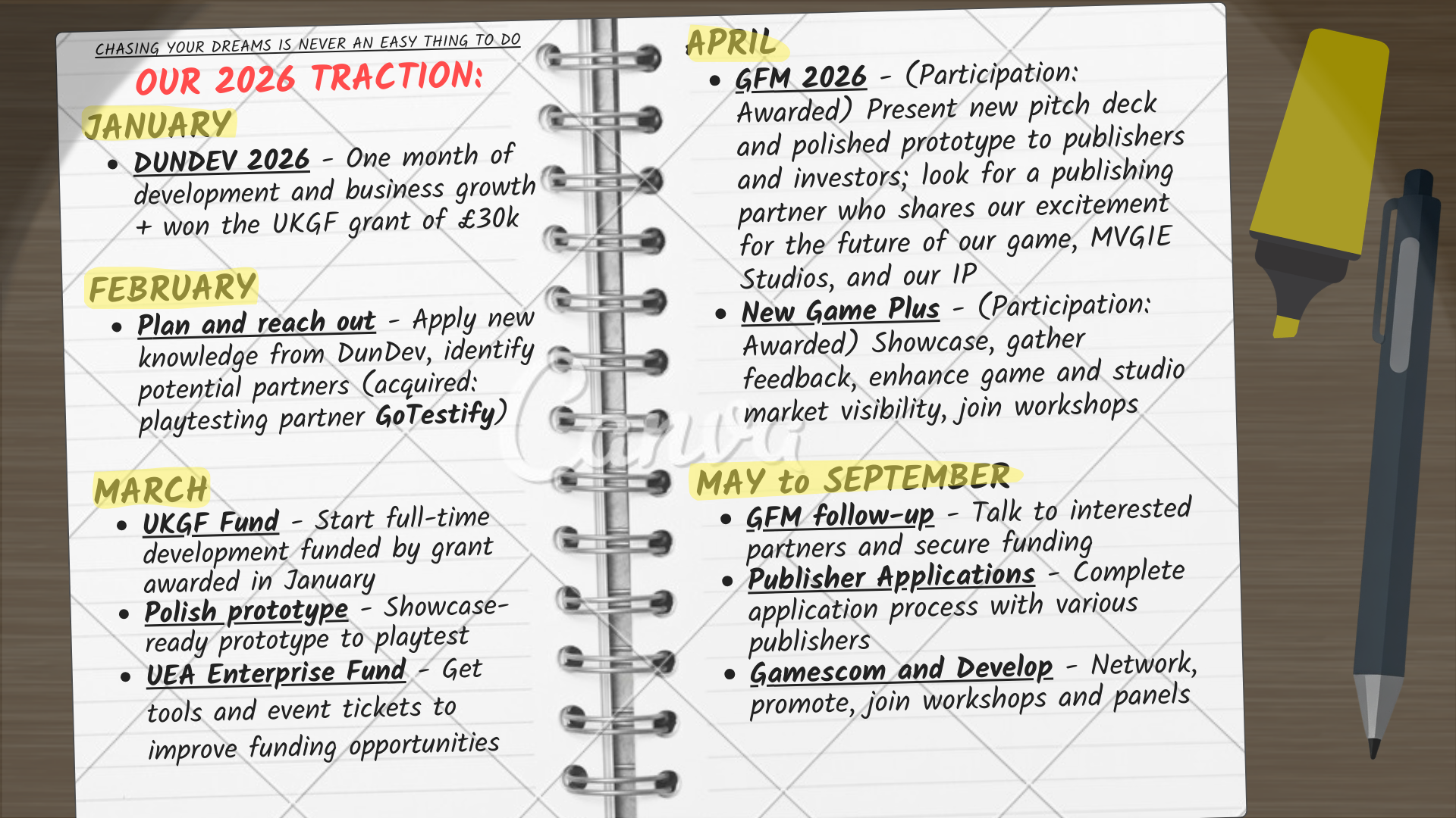
^ Instead of starting from scratch every time, I iterated on the same setup after the assets were found. In this case: I darkened the desk to fake night time, added semi-transparent shapes to simulate lamp light and shadows, rendered those shapes separately as images, and then blurred them for realism.
Ultimately, improvement came from time, experimentation, and squeezing everything I could out of Canva, Photoshop, and PowerPoint. If I could do it despite nonexistent artistic skills (beautiful doodles aside) and juggling three other MVGIE hats, I genuinely believe anyone can.
Next week, I’ll write about the actual content of a pitch deck, the very thing I side-lined at the beginning of this post, summarizing what we’ve learned through trial, error, and five years of accumulated (and often contradictory) advice.
In the meantime, feel free to reach out via email or LinkedIn.
See youse next time!
Allie
Share this post